Overview
The Dashboard is the first page you land on after logging in to Pingtree. It gives you an at-a-glance view of how your campaigns are performing across clicks, form submissions, conversions, revenue, cost, and profit — all in one place. The Dashboard is designed to surface the most important information immediately, with filtering and drill-down tools available to go deeper when you need to.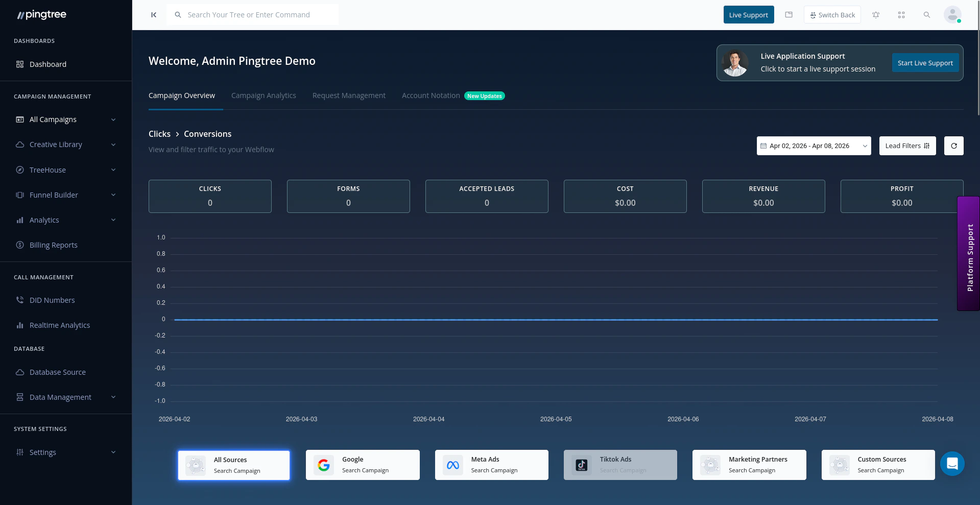
Pingtree dashboard showing KPI cards, performance graphs, and campaign filters
KPI Summary Cards
At the top of the Dashboard you will find a row of metric cards that summarize your campaign performance for the selected date range.Date Range Filtering
Use the date range picker in the top-right of the Dashboard to control the time window for all metrics and charts. Pre-built ranges include:- Today
- Yesterday
- Last 7 Days (default)
- Last 30 Days
- This Month
- Last Month
- Custom range
Lead Filters
Click the Lead Filters button to open the filter panel. You can narrow down all Dashboard data by:- Campaign — Filter to a specific offer campaign
- Buyer — Show data for one or more buyers/endpoints
- Source — Filter by a specific traffic source
- Media Type — Filter by traffic channel (see below)
Media Type Quick Filters
Below the main KPI cards, a row of media type buttons lets you instantly segment the Dashboard by traffic channel:Saved Filters
You can save any combination of filters as a named preset so you can reuse it without reconfiguring each time.1
Apply Your Filters
Set the date range, campaign, buyer, source, and media type filters to the combination you want to save.
2
Save the Filter
Click Save Filter, give the preset a name, and confirm. The preset is saved to your user account.
3
Reuse the Filter
Open the filter panel and select the saved preset from the list. All filters are applied instantly.
Click-to-Conversion Graph
The Clicks to Conversions line chart is the primary trend graph on the Dashboard. It plots:- Clicks — raw traffic volume over the selected period
- Conversions — accepted leads or sales attributed to that traffic
Cost and Spend Activity
The Cost and Spend Activity section sits below the click-to-conversion chart and shows your financial performance trend over the selected date range. Summary metrics displayed alongside the chart:
The chart uses a stock-style area chart to visualize revenue and cost trends over time, making it easy to spot periods where margins compressed or expanded.
Lead Distribution Panel
The Lead Distribution section shows how leads are moving through your distribution pipeline for the selected campaign and date range:
A trend indicator (up/down arrow with percentage) shows whether today’s attempted and accepted lead volumes are above or below yesterday’s baseline.
Funnel Performance Chart
The Dashboard includes a Funnel Builder - Funnels table that lists your active funnels alongside key performance data. From here you can quickly navigate to any individual funnel’s dashboard without leaving the overview.Source-Level and Buyer-Level Breakdowns
Below the main charts, the Dashboard provides tabular breakdowns of performance by:- Source — shows clicks, forms, accepted leads, cost, and conversion rate per traffic source
- Buyer — shows accepted leads, revenue, and endpoint-level acceptance rates per buyer